I'm obsessed with all things Mid-Century Modern, because my most impressionable years 0 -10 were stuffed with this genre. Even when this epic design period ended and swirly neon hippie cool things like lava lamps, black lights, and shag carpeting were coming into vogue, people couldn't afford to run out and redecorate their house, so the influence lasted far into the seventies, thus it's been engraved into my brain pan.
[Mid-century modern, or MCM for short, spawned
from a cultural movement that
spanned the realms of architecture, landscaping, furniture, graphic design, art, fashion, literature, philosophy, and music
in the late 19th century in Europe. The guiding architectual principle of the
movement was function over fussiness, and making conceptual artistry
attainable through everyday objects roughly 1933 to 1965. It is very distinct and easy to spot.]
Mid-Century Mod has made a huge come back, not that it ever really went away.
It's had an unbelievably enduring
popularity. In Dallas, in the past ten years I've seen a surge in new construction and in the sale of existing homes grabbing top dollar, even if, and especially if, they are in their original state. Here's a few pictures of homes that utilized then-groundbreaking post and beam architectural design that eliminated bulky support walls in favor
of walls seemingly made of glass.
Many consider Frank Lloyd Wright's
principle movement of organic architecture, easy access to nature, combined with Arts and Crafts as an
American jumping point for the aesthetic of Mid-Century Modern, but it was really an American
reflection of the International and Bauhaus movements.
Brazilian and Scandinavian architects
were very influential at this time, with a style characterized by clean
simplicity and integration with nature. Defining characteristics of MCM in architecture is the use of steel, large flat panes of glass,
clerestory windows, decorative screens, cantilevered roofs, flat roofs,
split-level rooms, with Japanese touches, partial walls, stacked brick, and
integration with nature. The use of these characteristics varies
depending on the style of home, whether it’s a sprawling ranch or case
study type dwelling.It's whatever money can buy, or bought back in the 30's, 40's, 50's and 60's.
Mid Century Mod Graphic Design had a certain look that we all identify with that era. It was influenced in part by the Dutch De Stijl Movement and the German Bauhaus Schools of Thought on Design and perhaps cubism. Recognizable is the limited color palette, often times black, red, mustard, or avocado green. There was the use of thin lines, and shapes at the ends, muted tones, and overlays, overlapping, funky patterns with shapes inside shapes, cut outs, and a distinct style of cartoon characters. It's hard to nail down the exact principles, other than to say they were breaking all the rules and perhaps imbued the simplicity that the entire MCM movement embraced.
Here are some classics.
Mid-Century modern has been kitschy cool with niche collectors and now those retro pieces are gathering mainstream momentum.
Mad Men, with
its glamorous portrayal of MCM fashion and home style, has been a major
contributor to the new influx of interest. Don Draper brought back the skinny tie and thin lapels and drinking in the morning.
Mid-century Modern is identifiable in the packaging of the times.
What I find interesting is how the MCM graphic design wove it's way into fashion, most obvious is the retro bowling shirt.
The same design elements of line and color show up in everyday objects like clocks, glassware, and dishes. So it's easy to see how one form of art influences the rest during the same time period.
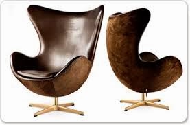
Mid-century Mod was all about the chair. Famous designers of the time: like Jacobsen, Wegner, and Eames designs have remained timeless.
There's the classic living room from MCM seen here in the Brady Bunch. The simple lines and blend of colors transcend into the walls, floors, and furniture.
I hope this litany of pics shed some light on what the big fuss is about in collecting and returning to this simple yet fun time. Mid-century Mod devotees from around the world could add a plethora of thoughts, images, and insight into these crib notes. So don't stop your research here, since I've only just scratched the surface...there's a whole lot more to look at.


No comments:
Post a Comment